Tuesday, January 28, 2014

Portfolio 3, Portraiture and Figure Drawing

In college I was tasked with drawing and painting many things, but I loved most to re-create people.
 
What follows are figure drawing studies in Red Conte Crayon, Black Conte Crayon, and portraits in watercolor, oil, and chalk pastel.
 
 Red Conte Crayon figure studies


 Self-portrait in Red Conte Crayon


Pastel portrait study of Peek 


Final oil painting titled Peek


Black Conte Crayon portraits of woman sleeping


Black Conte Crayon studies of human features and figures


Here follows some of my better achievements:


Mouth
I really like this portrait. It's off-center, with no eyes, barely a nose, and muted tones. Something about it has always spoken to me, and it's not because I made it.
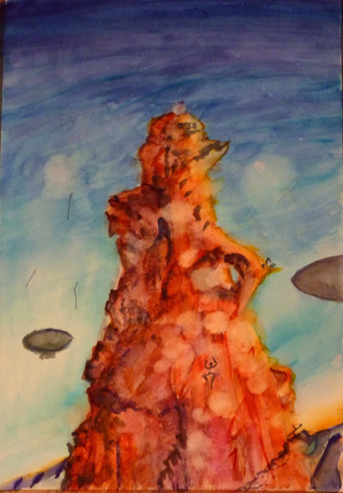


Dusk
This painting gives me fits. Sometimes I look at it and it's excellent. Then I look again and I see every flaw (and there are many). I think this painting is ultimately the sign of an immature painter that could not overcome his own flaws. This painting now only exists electronically. It has been destroyed-by-gesso. The canvas now resides in my parent's basement. 


Wedding
A watercolor portrait I painted of my wife on our wedding day. To date, it is the finest painting I have ever created. The credit goes to the subject of the painting, not the painter. This painting has won awards, been featured in a museum exhibition, and is simply my favorite. Maybe I shouldn't have a favorite, but I do.

Portfolio 2, Children's Book

In college, I took a class called Children's Literature. The professor offered one hundred extra points to create a children's book. I took him up on the offer, wrote, and drew illustrations for my book called Never Ever #1.

It was a fun project, the original book was completed in its entirety with pen and ink and colored pencils on a 22 page sketch pad.It now resides on a shelf.

What follows are the panels created electronically for possible submission to editors.

Panels 1 and 2, to lead off the book. Basically a thesis statement for the story that follows.


The other panels I created are kind of scatter shot. They do not follow the chronology of the book. I wanted to create a smattering of panels to convey what the book would ultimately look like. 


The story is fairly simple. An average kid is always being out-done by a nice-looking blond kid and it makes him more determined to achieve great things. Over time, he becomes really successful by never giving up on his goals. At the same time the blond kid becomes a famous formula one racer, then, at the end of the book, dies in a fiery crash. The last panel shows that the average kid (now an adult) is happy about it. He leans back in his overstuffed chair in his corner office and says "Second Place Ain't So Bad." 

This book sounds kind of awful now that I type it all out like this. 

At least my professor gave me all one hundred points.

Sunday, January 26, 2014

Portfolio 1, Still-Life Studies


Sitting in Drawing 1, my first drawing class in college, this was what was waiting for me: three oranges, a pear, a mug and a goblet. 


My first foray into the world of painting things made of glass. I had to find out the hard way that translucent and transparent materials get their form from what is behind them and shining through them. It seems obvious now, but I had a habit of making things up on the canvas when it got tedious. I wish I could say that doesn't happen any more, but it does!
In this painting I completely invented the background. I wanted a smokey, atmospheric image, that allowed the items to pop in the foreground. I found that inventing the background made the colors in the glass forms incorrect, so I had to invent those as well. I was lucky that it turned into a more dynamic image than I was actually seeing at the time. 

Quoth my art professor: "Why are you always inventing things?!"    


I wanted to continue with the challenge of re-creating the look of glass. I began a series of experiments with a still-life set-up that remained the same through the entire process. Above is the chalk pastel creation. The background was accurate this time. The set-up was inside of a cardboard box that I made. I learned from the last one. 


This painting is an abstract version of the set-up that traded detail in favor of (for lack of a better term) highlighting the highlights found in the glass. Not an amazing painting, but a fun experiment. 


Because I'm ridiculously creative, the final product is titled Bottles. I covered the cardboard box that I constructed with a white sheet to add a variable appearance to light and shadows cast through the bottles. Maybe I shouldn't take credit for that...

Quoth my art professor: "Why don't you cover that up with some fabric? It would look better!"

Saturday, January 25, 2014

Bridget's Room Series: The Race, part 1

The Race takes place in the same world as The Town. The events of this race occur about 20 minutes after the events in The Town. If you look carefully at the background of The Town you can see the red rock butte that constitutes the finish line for this second painting, The Race. 

The initial sketch of what will become The Race.


 Jumping into the application of color.


Refining the rock butte requires several techniques: Addition of color in intersecting planes as well as stippling to indicate smaller rocks. Removal of color to indicate highlights and smoother areas. 


Initial indication of other people/ things in the sky racing toward the summit. 


Next up: Part 2!