


At the same time birds were added to indicate depth. I also needed to make the objects in the sky overlap to continue the suggestion of depth.

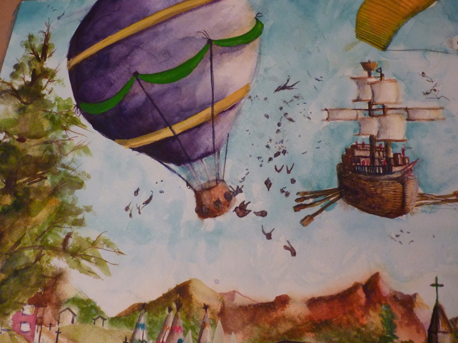
The two balloons within the painting were looking too similar and I wanted differentiation. This balloon was modeled after an antiquated, turn of the century balloon.

The skydiver caused many issues. The nylon baffles of the chute are naturally translucent, but the paper was overworked, so I added white. This is not traditional nor academically correct. The traditional way a watercolor is created is by using the white of the paper to stand as highlight.White pigments can naturally flatten out paintings and so it is discouraged. I do it all of the time and if used correctly, has many advantages.


The town proper. The buildings and people in the streets were amended to seem taller and smaller respectively. The initial town buildings had the same number of floors and windows as the blue house, the people were the same size as the people in the house's yard. The perspective was thrown off by this, so it was repaired.


Finished Bridget, overlooking the town.

And the finished product. The Town.

Next up in Bridget's Room Series: The Race!
No comments:
Post a Comment